Motion Toast
A beautifully designed toast notification widget with smooth animations for Flutter. Built with Material 3 support, null safety, and full customization in mind.


| Success | Warning |
|---|---|
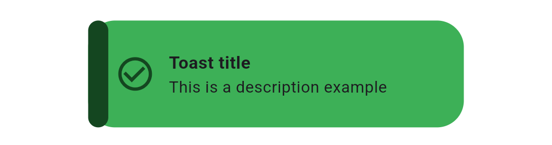 |
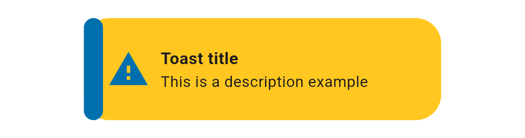 |
| Info | Error |
|---|---|
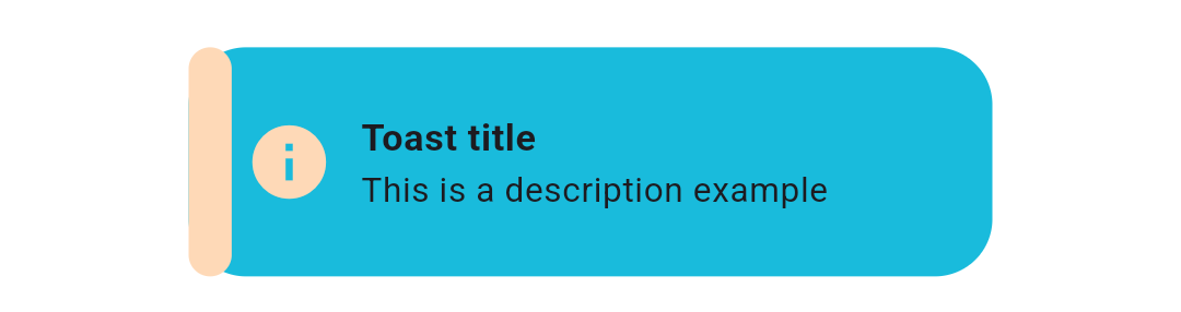 |
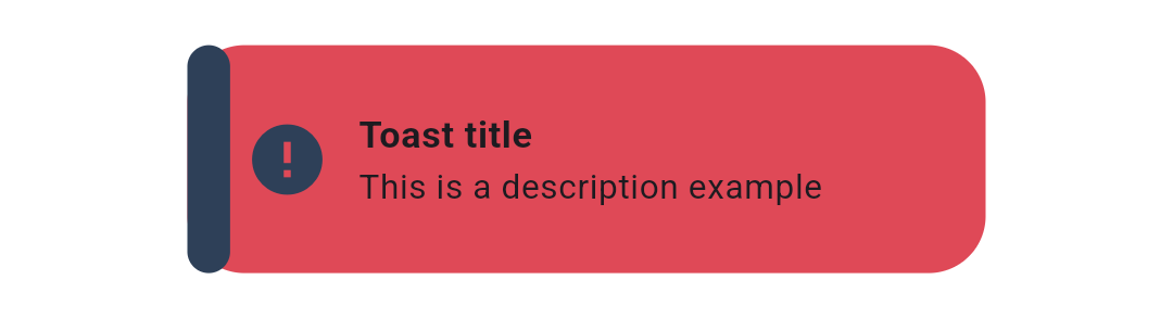 |
Overview
Motion Toast provides an elegant and customizable notification system for your Flutter applications. Display status messages with smooth animations, built-in toast types, and extensive theming options.
Perfect for:
- User feedback after actions (success/error/warning)
- Temporary notifications
- Non-intrusive information display
- Multi-toast scenarios
Features
- ✨ Animated Toasts - Smooth animations with configurable types
- 🎨 Theme Support - Full Material 3 support with light/dark modes
- 🏗️ Built-in Types - Success, Warning, Error, Info, Delete toast types
- 🎯 Custom Toasts - Fully customizable design with your own colors and icons
- 🔄 Multiple Animations - Slide in from top/bottom/left/right
- 💫 Heartbeat Animation - Animated icon with optional heartbeat effect
- 🌍 Internationalization - LTR and RTL text direction support
- 📱 Responsive - Automatically adapts to device size
- 🎛️ Highly Customizable - Configure appearance, timing, behavior, and more
- 👥 Multiple Toasts - Display simultaneous notifications
- 🚫 Dismissible - Optional manual dismiss functionality
- 🔒 Null Safe - Built with null safety in mind
Installation
Add this to your package's pubspec.yaml file:
dependencies:
  motion_toast: ^2.15.0
Or install from the command line:
flutter pub add motion_toast
Quick Start
Basic Example
The simplest way to show a success toast:
MotionToast.success(
  title: const Text("Success"),
  description: const Text("Your action was successful"),
).show(context);
All Built-in Types
Success Toast
MotionToast.success(
  title: const Text("Success Motion Toast"),
  description: const Text("Example of success motion toast"),
).show(context);
Warning Toast
MotionToast.warning(
  title: const Text("Warning Motion Toast"),
  description: const Text("This is a warning message"),
).show(context);
Error Toast
MotionToast.error(
  title: const Text("Error"),
  description: const Text("Please enter your name"),
).show(context);
Info Toast
MotionToast.info(
  title: const Text("Info Motion Toast"),
  description: const Text("Example of info toast"),
).show(context);
Delete Toast
MotionToast.delete(
  title: const Text("Deleted"),
  description: const Text("Item has been deleted"),
).show(context);
Usage Examples
Custom Toast
Create a fully customized toast with your own colors and icons:
MotionToast(
  icon: Icons.alarm,
  primaryColor: Colors.pink,
  title: const Text("Custom Toast"),
  description: const Text("You can customize the toast!"),
  width: 300,
  height: 100,
).show(context);
Positioning
Top Position
MotionToast.success(
  title: const Text("Top Motion Toast"),
  description: const Text("Displayed at the top"),
  toastAlignment: Alignment.topCenter,
  animationType: AnimationType.slideInFromTop,
).show(context);
Center Position
MotionToast.success(
  title: const Text("Center Motion Toast"),
  description: const Text("Displayed in the center"),
  toastAlignment: Alignment.center,
).show(context);
Bottom Position (Default)
MotionToast.success(
  title: const Text("Bottom Motion Toast"),
  description: const Text("Displayed at the bottom"),
  toastAlignment: Alignment.bottomCenter,
).show(context);
Right-to-Left (RTL) Support
For Arabic, Hebrew, and other RTL languages:
MotionToast.success(
  title: const Text("من اليمين"),
  description: const Text("هذا مثال بالعربية"),
  layoutOrientation: TextDirection.rtl,
  animationType: AnimationType.slideInFromRight,
  width: 300,
).show(context);
Two-Color Toast
Use primary and secondary colors for visual emphasis:
MotionToast(
  icon: Icons.zoom_out,
  primaryColor: Colors.orange[500]!,
  secondaryColor: Colors.grey,
  title: const Text("Two Color Motion Toast"),
  description: const Text("Primary and secondary colors"),
  toastAlignment: Alignment.topCenter,
  animationType: AnimationType.slideInFromTop,
  height: 100,
  width: 300,
).show(context);
Transparent Background
MotionToast(
  icon: Icons.zoom_out,
  primaryColor: Colors.grey[400]!,
  secondaryColor: Colors.yellow,
  opacity: 0.4,
  title: const Text("Transparent Toast"),
  description: const Text("Semi-transparent background"),
  toastAlignment: Alignment.center,
  height: 100,
  width: 300,
).show(context);
Custom Styling
Without Sidebar and With Border
MotionToast(
  icon: Icons.zoom_out,
  primaryColor: Colors.orange[500]!,
  secondaryColor: Colors.grey,
  title: const Text("Custom Style Toast"),
  description: const Text("No sidebar with visible border"),
  displayBorder: true,
  displaySideBar: false,
).show(context);
Sequential Toasts
Display toasts one after another using the onClose callback:
MotionToast.success(
  title: const Text("User Data"),
  description: const Text("Your data has been saved"),
  onClose: () {
    MotionToast.info(
      title: const Text("Info"),
      description: const Text("Next notification"),
    ).show(context);
  },
).show(context);
Programmatic Dismiss
Store the toast instance and dismiss it programmatically:
MotionToast toast = MotionToast(
  icon: Icons.alarm,
  primaryColor: Colors.blue,
  title: const Text("Custom Toast"),
  description: const Text("This toast can be dismissed"),
).show(context);

// Later, dismiss it programmatically
Future.delayed(const Duration(seconds: 2), () {
  toast.dismiss();
});
API Reference
Main Constructor Parameters
| Parameter | Type | Default | Description |
|---|---|---|---|
description |
Widget |
Required | The main text content of the toast |
title |
Widget? |
null |
Optional title text (not rendered if null) |
icon |
IconData? |
Varies | Toast icon (required for custom toasts) |
primaryColor |
Color |
Varies | Main background and accent color |
secondaryColor |
Color? |
primaryColor |
Sidebar and icon color |
width |
double? |
250 |
Toast width (null for responsive) |
height |
double? |
null |
Toast height (null for content-based) |
constraints |
BoxConstraints? |
null |
Size constraints for responsive design |
iconSize |
double |
40 |
Icon size in pixels |
enableAnimation |
bool |
true |
Enable heartbeat animation on icon |
layoutOrientation |
TextDirection |
ltr |
Text direction (ltr or rtl) |
animationType |
AnimationType |
slideInFromBottom |
Entry animation type |
animationDuration |
Duration |
1.5s |
Animation duration |
toastDuration |
Duration |
3s |
How long toast displays |
animationCurve |
Curve |
Curves.ease |
Animation timing curve |
toastAlignment |
Alignment |
bottomCenter |
Position on screen |
borderRadius |
double |
20 |
Border radius in pixels |
onClose |
Function? |
null |
Callback when toast closes |
dismissable |
bool |
false |
Allow manual dismissal |
barrierColor |
Color |
transparent |
Barrier overlay color |
margin |
EdgeInsetsGeometry |
0 |
Outer padding |
contentPadding |
EdgeInsetsGeometry |
0 |
Inner padding |
displayBorder |
bool |
false |
Show border around toast |
displaySideBar |
bool |
true |
Show colored sidebar |
opacity |
double |
0.9 |
Background opacity (0-1) |
Animation Types
enum AnimationType {
  slideInFromBottom,  // Default
  slideInFromLeft,
  slideInFromRight,
  slideInFromTop,
}
Methods
show(BuildContext context)
Display the toast on screen and return the MotionToast instance for later control.
MotionToast toast = MotionToast.success(
  title: const Text("Success"),
  description: const Text("Action completed"),
).show(context);
dismiss()
Programmatically close the toast before its duration expires.
toast.dismiss();
Advanced Usage
Responsive Design with Constraints
For better responsive behavior across different screen sizes:
MotionToast.success(
  title: const Text("Responsive Toast"),
  description: const Text("Adapts to screen size"),
  constraints: const BoxConstraints(
    minWidth: 200,
    maxWidth: 400,
    minHeight: 80,
    maxHeight: 150,
  ),
).show(context);
Custom Callback on Close
Execute actions when the toast completes or is dismissed:
MotionToast.success(
  title: const Text("Done"),
  description: const Text("Operation complete"),
  onClose: () {
    print("Toast was closed");
    // Execute your logic here
  },
).show(context);
Platform Support
- ✅ Android
- ✅ iOS
- ✅ Web
- ✅ macOS
- ✅ Windows
- ✅ Linux
Troubleshooting
Toast not appearing
- Ensure you're calling
.show(context)on theMotionToastinstance - Verify the
contextis from a widget within aMaterialApporCupertinoApp - Check that
toastDurationis sufficient to see the toast
Animation issues
- Try adjusting
animationDurationfor slower/faster animations - Change
animationCurveto experiment with different timing - Ensure
enableAnimationistrueif you want the heartbeat effect
Multiple toasts overlapping
- Use
onClosecallback to show toasts sequentially - Use different
toastAlignmentvalues to position toasts in different areas - Increase
toastDurationto give toasts time to display
Contributing
Contributions are welcome! Please feel free to submit a Pull Request. For major changes, open an issue first to discuss what you would like to change.
See the CHANGELOG.md for version history and updates.
- Found a bug? Open an issue
- Have a feature request? Open an issue
- Want to contribute? Submit a pull request
Contributors
License
This project is licensed under the MIT License - see the LICENSE file for details.