viewHeaderStyle property
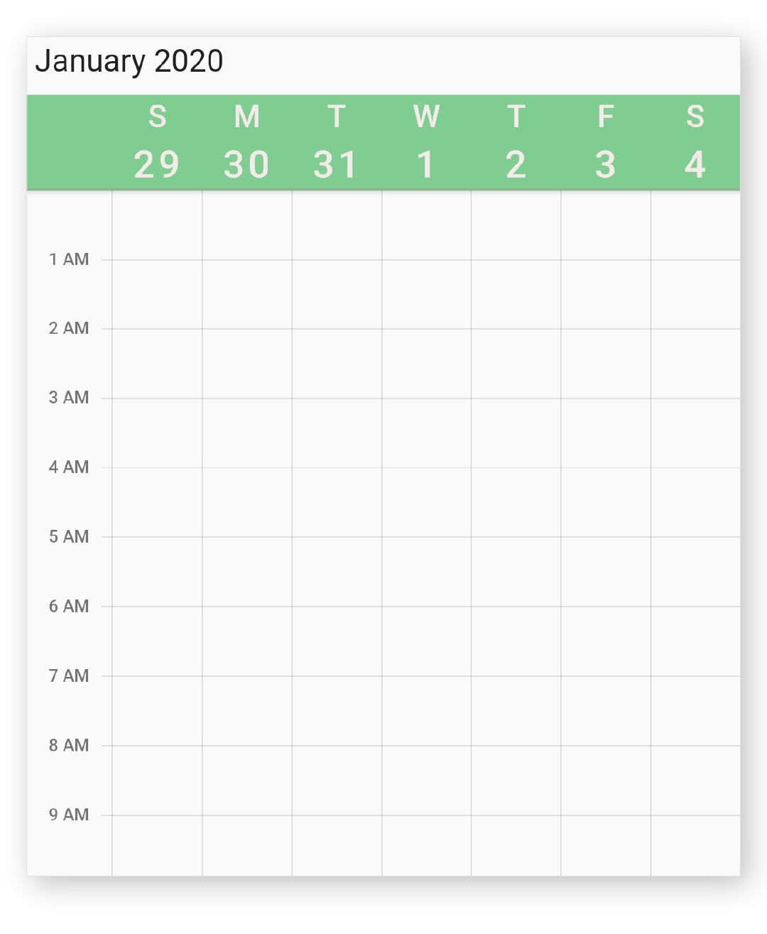
Sets the style to customize SfCalendar view header.
Allows to customize the ViewHeaderStyle.backgroundColor, ViewHeaderStyle.dayTextStyle and ViewHeaderStyle.dateTextStyle in view header of calendar.
See also:
- ViewHeaderStyle, to know about the available customization options for view header view in calendar.
- viewHeaderHeight, to customize the size of the view header view in calendar.
- Knowledge base: How to format day and date of view header
- Knowledge base: How to add custom header and view header
- Knowledge base: How to highlight tapped date in view header
Widget build(BuildContext context) {
   return Container(
     child: SfCalendar(
       view: CalendarView.week,
       viewHeaderStyle: ViewHeaderStyle(
           backgroundColor: Colors.blue,
           dayTextStyle: TextStyle(color: Colors.grey, fontSize: 20),
           dateTextStyle: TextStyle(color: Colors.grey, fontSize: 25)),
     ),
   );
 }
Implementation
final ViewHeaderStyle viewHeaderStyle;