


fluent_ui 1.2.2  fluent_ui: ^1.2.2 copied to clipboard
 bdlukaa.dev
Implements Fluent Ui in flutter. Based on the official documentation
fluent_ui


Design beautiful native windows apps using Flutter
Unofficial implementation of Fluent UI for Flutter. It's written based on the official documentation
Motivation #
Since flutter has Windows support (currently in stable under an early release flag as of 11/03/2021), it's necessary to have support to its UI guidelines to build apps with fidelity, since it has support for Material and Cupertino. See this for more info on the offical fluent ui support
See also:
Roadmap #
Currently, we've only done the desktop part of the library, so you can import the library as one itself:
import 'package:fluent_ui/fluent_ui';
Note: this does not mean you can't use this library anywhere else. You can use it wherever you want
Futurely, once the desktop part of this library gets mature, web and mobile will also be supported. See also:
Also, futurely there will be a way to get the current device accent color. For more info, see accent color
Usage #
[Inputs Preview] [Forms Preview]
Style #
You can use the Theme widget to, well... theme your widgets. You can style your widgets in two ways:
- Using the
FluentAppwidget
FluentApp(
  title: 'MyApp',
  style: Style(
    ...
  ),
)
- Using the
Themewidget
Theme(
  style: Style(
    ...
  ),
  child: ...,
),
Icons #
Inside your app, you use icons to represent an action, such as copying text or navigating to the settings page. This library includes an icon library with it, so you can just call Icons.[icon_name] in any Icon widget:
Icon(Icons.add_regular)
To style icons, you can use IconStyle in the app Style or use the property style in the Icon widget. You can see the list of icons here
Colors #
This library also includes the Fluent UI colors with it, so you can just call Colors.[color_name]:
TextStyle(color: Colors.black)
Avaiable colors:
Colors.transparentColors.whiteColors.blackColors.greyColors.yellowColors.orangeColors.redColors.magentaColors.purpleColors.blueColors.tealColors.green
Accent color
Common controls use an accent color to convey state information. By default, the accent color is Colors.blue. However, you can also customize your app's accent color to reflect your brand:
Style(
  accentColor: Colors.blue,
)
Brightness #
You can change the style brightness to change the color of your app.
Brightness.light
Brightness.dark
It defaults to the brightness of the device. (MediaQuery.of(context).brightness)
Typography #
To set a typography, you can use the Style class combined with the Typography class:
Style(
  typography: Typography(
    caption: TextStyle(
      fontSize: 12,
      color: Colors.black,
      fontWeight: FontWeight.normal,
    ),
  ),
)
Font
You should use one font throughout your app's UI, and we recommend sticking with the default font for Windows apps, Segoe UI. It's designed to maintain optimal legibility across sizes and pixel densities and offers a clean, light, and open aesthetic that complements the content of the system.

Type ramp
The Windows type ramp establishes crucial relationships between the type styles on a page, helping users read content easily.

Widgets: #
(1) = High priority
(2) = Medium priority
(3) = Low priority
NOTE: The code for all the images below can be found on the example folder
| Widget | Preview |
|---|---|
| Button | 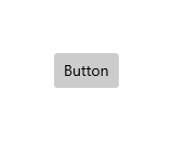 |
| Checkbox | 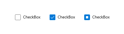 |
| RadioButton |  |
| Slider | 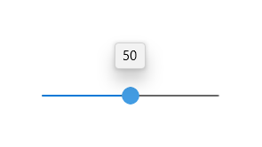 |
| ToggleButton | |
| ToggleSwitch | 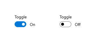 |
| (3) DropDownButton | |
| SplitButton | 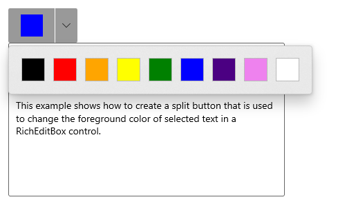 |
| RatingControl | 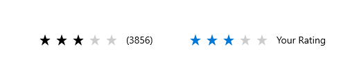 |
| Widget | Preview |
|---|---|
| TextBox | 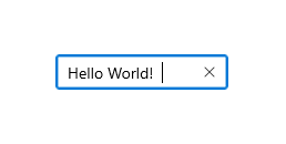 |
| (3) Auto suggest box | |
| (2) ComboBox |
| Widget | Preview |
|---|---|
| Dialogs |  |
| (3) Flyouts | |
| (3) Teaching tip | |
| Tooltip | 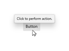 |
| Widget | Preview |
|---|---|
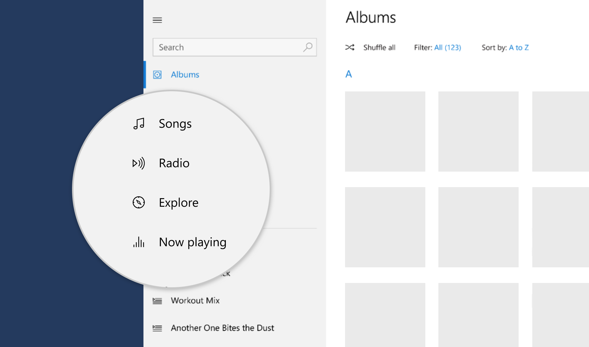
| Navigation View | 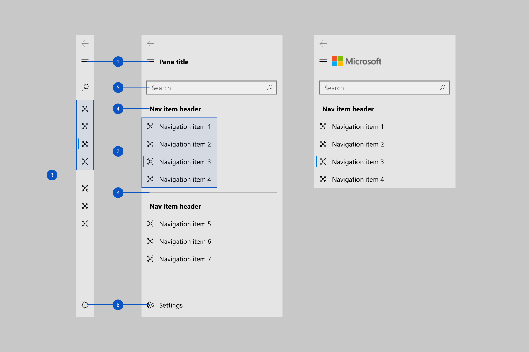 |
| (3) Pivot | |
| (3) TabView |
Pickers:
- (3) Date and time
- (3) Calendar date picker (Depends on ComboBox)
- (3) Calendar view
- (2) Date picker (Depends on ComboBox)
- (2) Time picker (Depends on ComboBox)
Others:
- (1) Progress indicators
- ✔️ Acrylic
- (3) Reveal Highlight
- (3) Reveal Focus
- (3) Info bar
- (3) Badges
- (3) Sound
- (3) Contact card
- (3) Flip View
- (3) Tree View
- (3) Pull to refresh
Contribution #
Feel free to open an issue if you find an error or make pull requests.
All the widgets above with the mark of (3) will not be implemented soon, so you can create a pull request with the implementation for them :)
Metadata
Publisher
Weekly Downloads
Metadata
Implements Fluent Ui in flutter. Based on the official documentation
Repository (GitHub)
View/report issues
License
 unknown (license)